A Simple, Repeatable UI Design Process
As designers, we naturally cringe when we hear the words “constraints”, “process”, or “methodology.” We don’t want to be boxed in, we want complete freedom to imagine new possibilities, create new worlds, and push the boundaries. We want to be able to start with a completely blank canvas and give our creativity free reign of expression.
Although it runs counter to our instincts, design constraints can actually push a designer to create something better and more useful than if presented with a blank slate. Moreover, the most successful artists develop their own processes and methods that lead to wonderfully creative work.
The most successful artists develop their own processes and methods that lead to wonderfully creative work.
This same principle holds true as applied to UI design. By establishing an effective, repeatable process for laying out web pages, we’re able to produce consistent, high-quality work that accomplishes organizational goals, considers user intent, and inspires delight. Here is one simple, repeatable process that we use as a framework for our UI design work.
Beginning Assumptions - What We've Already Done
Our process always starts with a robust discovery, where we review stakeholder goals, user priorities, the customer lifecycle, current analytics, competitor research, existing assets, and more. As a result, we have a solid understanding of the goals and mission of the organization or product, deep insight about the users and their needs, and clarity into what we’re trying to accomplish with the website.
We’ve also already done the information architecture work for the site. We’ve determined what types of content are going to be published to the site, organized it into sections, and drawn up a sitemap.
Armed with the treasure trove of information we’ve gathered in discovery and a good sitemap, we’re now ready to lay out our first page.
Step One - Navigation!
Determining how the navigation works on a site may be the single most important—and challenging—design decision to be made. The navigation will be used on every page of the site, and if executed poorly will result in user frustration and ultimately an unsuccessful design. For smaller, simpler sites, navigation structure can be somewhat straightforward. For larger sites with two- and three- level deep navigation structures, it becomes one of the major design considerations, especially when thinking about the mobile experience.

What type of navigation structure will be best suited for this site? If it is two or three deep, would it be best to design a dropdown for one-click entry into the second or third level pages, or would a more guided experience be better (i.e. steering the user to visit a top-level page before diving deeper)? Depending on the audience and the brand, is an edgier, more engaging navigation best, or a more conventional and less potentially confusing solution?
It’s also important to consider the navigation experience across all devices. What will the user experience be on a smartphone, tablet, and desktop? Are there different considerations for each?
Regardless of how we design the navigation, we tackle it first, as it impacts layout decisions we make for every other page of the site.
Step Two - Determine Page Goals and User Intent
Just as we’ve uncovered the goals for the website as a whole, along with user priorities, we need to do the same for each page. What is the primary purpose of this page? Is it to persuade the user to a certain point of view, invite the user to engage, or present a resource? What type of user is most likely to visit this page? When they visit, where are they most likely to be in the customer lifecycle?
Prioritize Goals
You can only have one primary goal, so at this point we need to make an important decision on what our top priority is for the page. We refer back to our Discovery notes for help in making these decisions. In UI design, attempting to address multiple priorities with equal measure will result in ineffectual pages. Prioritization is one of the most important decisions UI designers can make, and these must always be informed and supported by our research. If telling the brand story is the top-ranked goal for a page, this will result in a much different design approach than if our primary purpose was to present value-laden resources to your users. You can’t do both effectively.
In UI design, attempting to address multiple priorities with equal measure will result in ineffectual pages.
Prioritize Users
Just as we can only have one primary goal, we need to determine a primary user type for the page. Which audience is most important to address on this page? The same message may not resonate with all of our user types, so we need to choose which should take priority for the page.
Step Three - List All Content To Be Included on the Page
Given what we’ve learned from our Discovery process, the site architecture that we’ve established, and prioritization of goals and users for the page, we should now have a really good idea about what content to include on the page. Our next step is to make a list of all the content that will be included on the page - and I mean everything.
Here is a short list of some possible content types that could be included on a page:
- Hero / featured content
- Value proposition
- Success stories or case studies listing
- Related content
- News
- Author name, image, thumbnail
- Publish date
- Social media share
- Social media follow
- Testimonials
- Copyright
- Privacy policy
- Call to Action
- Contact information
- Images, slideshows, videos
- Sub-navigation
- Capabilities/services listing
- Related brands, companies
- About the company/brand
- Links to third-party reviews
- Social validation
- Help/support links
We list them all out, getting as detailed as possible. If we know, for example, that three illustrations need to be created to accompany three content blocks, then we list each of them out along with the corresponding content.
At this point I should note that the best case scenario is to not only know what type of content is going where, but also the actual content itself. The best case scenario is for you as the designer to be working in collaboration with the content writer early on in the process. Design should serve the content, not vice versa.
Step Four - Group Related Content
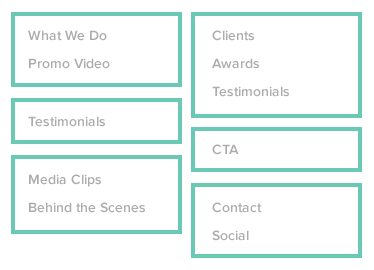
Our next step is to start organizing the content by grouping related information. Take an article page, for example. We have the article itself, which may include a title, written content, as well as supplemental content (images, videos, callouts, etc.). In addition, we may have meta content (information about the article) such as author name, thumbnail, date, categories, tags, etc. This is content that would be best served by grouping it together. We may also have related content, such as additional articles from the same category or other articles by that author. This is also content that probably makes most sense when presented together.
Some content, such as copyright, contact info, and social follow buttons may need to be included on every page of the site, so it may make sense to group this content together as well.
Content may also be grouped according to other factors, such as targeted user type, purpose (e.g. provide information or reassure the user), or content type (e.g. white papers, videos).
Step Five - Prioritize Content
At this point we have a number of content blocks that are to be included in our layout and a good handle of what our priorities are for the page. Now we work on ordering the content by priority.
The best designs result from rigorous prioritizing.
I can’t emphasize enough how important it is to prioritize. If all the content were give the same priority it will lead to a disastrous design. Users wouldn’t know where to look or understand what you’re asking them to do. Here’s where it’s important to be able to have frank discussions with stakeholders who may think it’s possible to do everything on one page, to have everything “above the fold.” The best designs result from rigorous prioritizing.
Step Six - Hand-Sketched Wireframes
We’re finally ready to get into what we traditionally think of as UI design work. But resist the urge to jump right into Photoshop or Sketch! Instead, take out a pen or pencil and a sheet of paper and sketch out some hand-drawn wireframes. Getting into a design application at this point will may distract from our primary purpose, which is to come up with a layout that will work best, based on the content. If we jump right onto the computer, we can get distracted by details such as setting up and naming our files, choosing fonts and colors, establishing guides, etc.
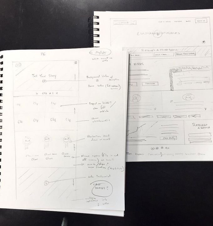
Sketching out your ideas… is still the fastest way to brainstorm and see your ideas, make your mistakes and build off of them, and to see your progression through to ideas you never thought of before.
Here’s where we begin to flesh out all of the design choices we’ve already made. For content that is to be grouped together, we start thinking about how those elements are combined most appropriately. When thinking of prioritization, this will generally follow the flow of the page, with higher priority content coming first (Western users scan left to right, top to bottom). We can also prioritize using size, color, imagery, and saturation.
Step Seven - Grey Box Method
Hand-drawn sketches are useful for quick iterations to determine the overall viability of a layout, but in order to truly test whether a design will work we need to see it in real-to-life proportions and sizes. Essentially we’re taking the sketched wireframes and making higher fidelity versions, tweaking and refining as we go.
Back in 2004, Jason Santa Maria wrote an article about a technique that he used that he coined the Grey Box Method. We have found this technique to be just the right amount of fidelity for this stage in UI design, and remain strong advocates for it. Here, we translate our sketches to the screen, making use of our preferred design tool (e.g. Photoshop, Illustrator, Sketch). We begin working at the sizes we’ll see the final site in, but are still focused on overall layout and flow. By using simple boxes and other shapes with grayscale values, and including fonts at true sizes and relative contrast values, we’re able to further test and refine our composition.

At this point we often begin experimenting with some typography, imagery, and illustration choices, as well relative saturation values for different sections on the page (still using only grayscale). Here we’re beginning to make design choices that move beyond just UI and layout concerns, as we’ve found that font choices, imagery and other design elements influence the direction of the overall layout. Rather than work in a strict waterfall approach, we’ve found a multi-threaded process, where we’re weighing several requirements at the same time, to be more effective. For example, we may begin to think about performance budgets, how the design will work across different devices and screen sizes, and what components we might want to reuse throughout the site. This makes for a much more efficient design process, as we don’t need to throw out or completely revamp our work later on down the road due to factors we hadn’t yet considered.
Extending Across the Entire Site
We repeat this process across all of the top-level pages of a site, and with any template that has a distinct purpose. By working across the entire site, patterns and relationships emerge that will prompt us to further refine our designs. In this way we arrive at a UI system that will work throughout the whole site, bringing unity to the individual pages and providing a framework for the work to follow.
We now have a set of grey box comps, already loaded into our design tool of choice. So when we begin to work with colors, fonts, images, and illustrations, we’re simply iterating on top of the work we’ve already completed.
In Conclusion
The process we’ve outlined here works well for our team. It’s not meant to be overly formulaic, nor is it a magic pill for creating wildly successful web sites. Ultimately it’s a designer’s taste, creativity, and sensibility that, when brought to bear on a specific project, turns it into something beautiful and useful. While those traits can’t be bottled or replicated (at least not yet), by following a simple, repeatable and proven process we’ve become more efficient at producing consistently high-quality work.
